How can we help?
Get help straight from our team...
Shortcodes
[sa_grid] Shortcode Guide
A user guide for the sa_grid shortcode.
Updated 2 weeks ago

What does it do?
The grid shortcode allows you to partition a page into sections, inside the grid columns are used to create a structure for the content to be displayed in. Up to 12 columns can be used, however the total sum of the columns must equal 12.
How do I use it?
To embed this shortcode into the page, you need to copy the following HTML:
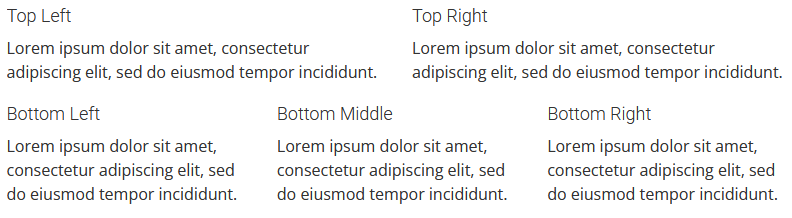
[sa_grid display="fluid"][sa_column size="6"]

<h4>Top Left</h4>
<p>Lorem ipsum dolor sit amet, consectetur adipiscing elit, sed do eiusmod tempor incididunt.</p>

[/sa_column][sa_column size="6"]

<h4>Top Right</h4>
<p>Lorem ipsum dolor sit amet, consectetur adipiscing elit, sed do eiusmod tempor incididunt.</p>

[/sa_column][/sa_grid]

[sa_grid display="fluid"][sa_column size="4"]

<h4>Bottom Left</h4>
<p>Lorem ipsum dolor sit amet, consectetur adipiscing elit, sed do eiusmod tempor incididunt.</p>

[/sa_column][sa_column size="4"]

<h4>Bottom Middle</h4>
<p>Lorem ipsum dolor sit amet, consectetur adipiscing elit, sed do eiusmod tempor incididunt.</p>

[/sa_column][sa_column size="4"]

<h4>Bottom Right</h4>
<p>Lorem ipsum dolor sit amet, consectetur adipiscing elit, sed do eiusmod tempor incididunt.</p>

[/sa_column][/sa_grid]
Rules:
size="" - sets the size of the column. (columns must total 12, e.g. 8 + 4, or 6 + 6)display="" - sets the format of the grid. (fluid: full width)Mobile Rules - Medium="12" or large="12" will overrule the default size="#"
Once you have copied this, paste it into the page in the text editor view, click update/publish, and then refresh the page.